Hours Agonizing Over Color…

One of the number one reasons we get contacted by clients is indecision about color choices in the home. Weather it be an accent wall, kitchen cabinetry, woodwork, a powder room…choosing color requires a lot of courage. Color trends, like anything in design fluctuates with the current market. Keeping up on recent web posts or reading current magazines and catalogs is a simple way to stay abreast of what’s new in the world of color.

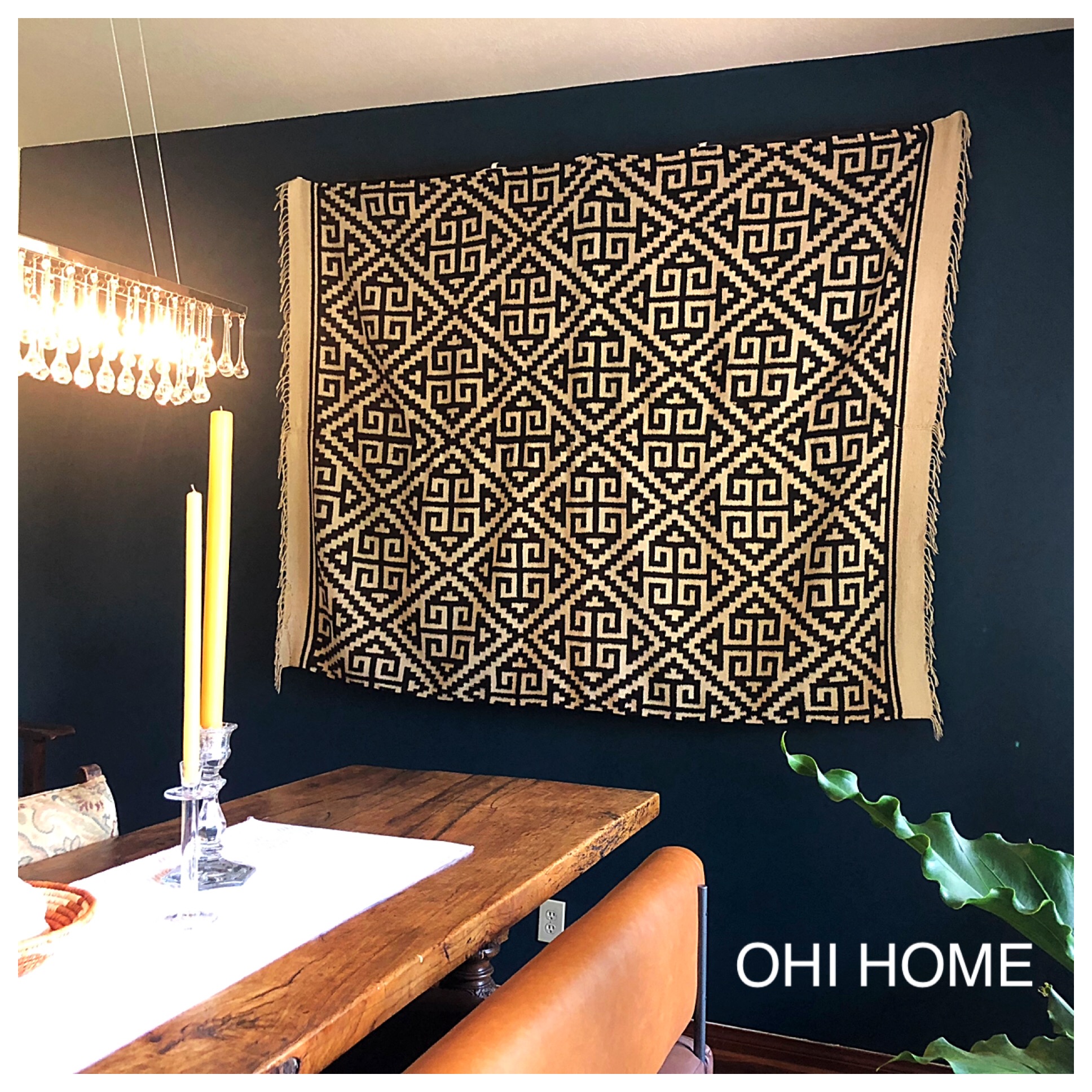
Dark teal has been showing up everywhere and we love this bold color. When choosing a color as bold as teal it’s important that there is an in depth period of exploration. In our search for the perfect teal (pictured above), we looked at magazines, read blogs and ordered color samples to try on our walls. The final chosen color, Dark Harbor by Benjamin Moore, was perfect. We used it to paint the back wall of a dining room to extend the feeling of depth in the room. Bold dark color often achieves this goal. We have accomplished the same goal in other rooms with shades of navy and black.

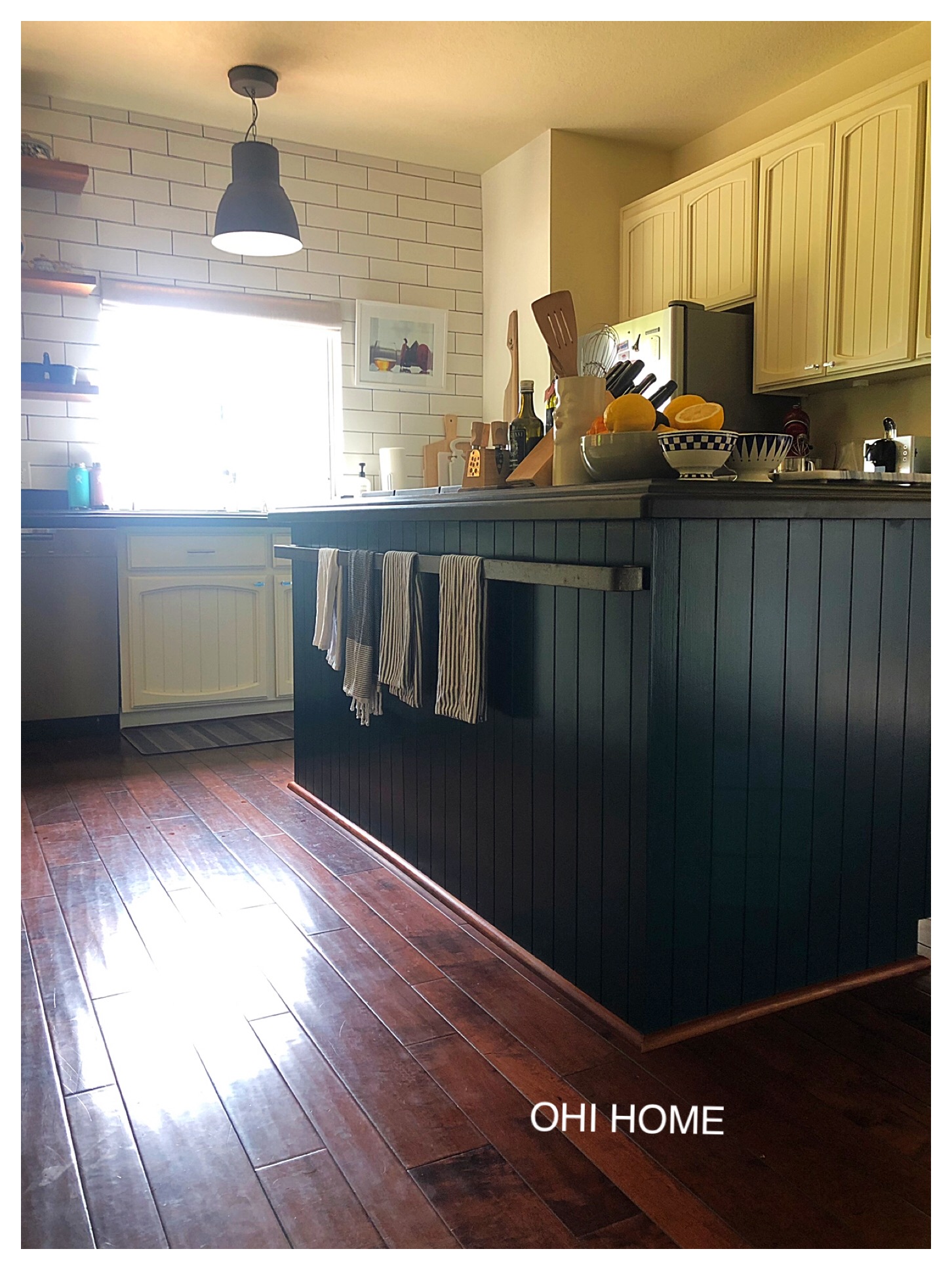
Bold color choices aren’t just for walls. A design trend we love is choosing bold color to help anchor cabinetry in a kitchen. Cabinetry no longer needs to all be the same color. We have done kitchens using one color for upper cabinetry and another for lower cabinetry. On the kitchen island pictured above, we used white paint on the cabinetry and the dark teal we used in the on dining room on the accent wall. This helped anchor the expansive kitchen and also added connection to the open dining/eating spaces.
Updating dated interior woodwork…


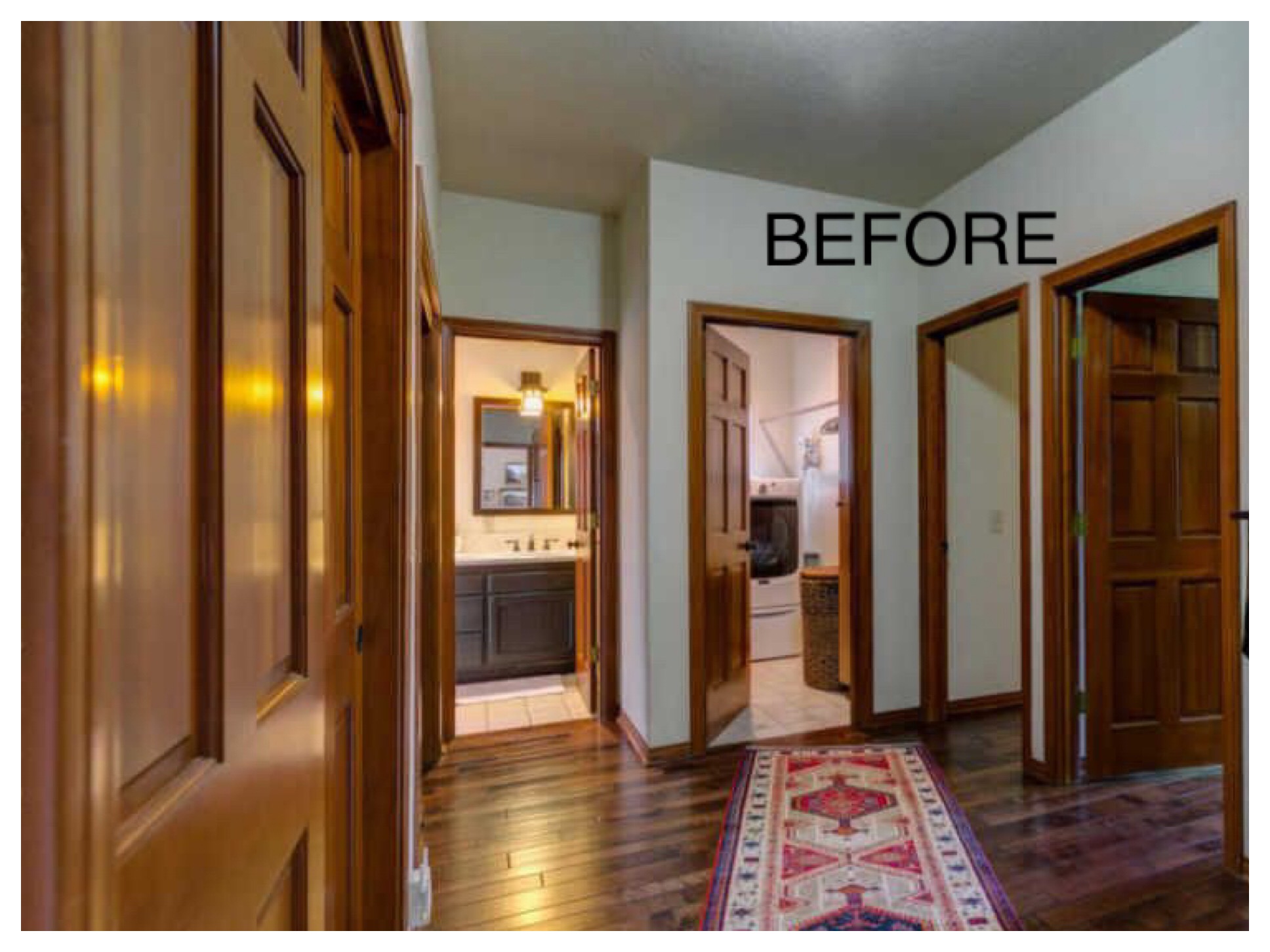
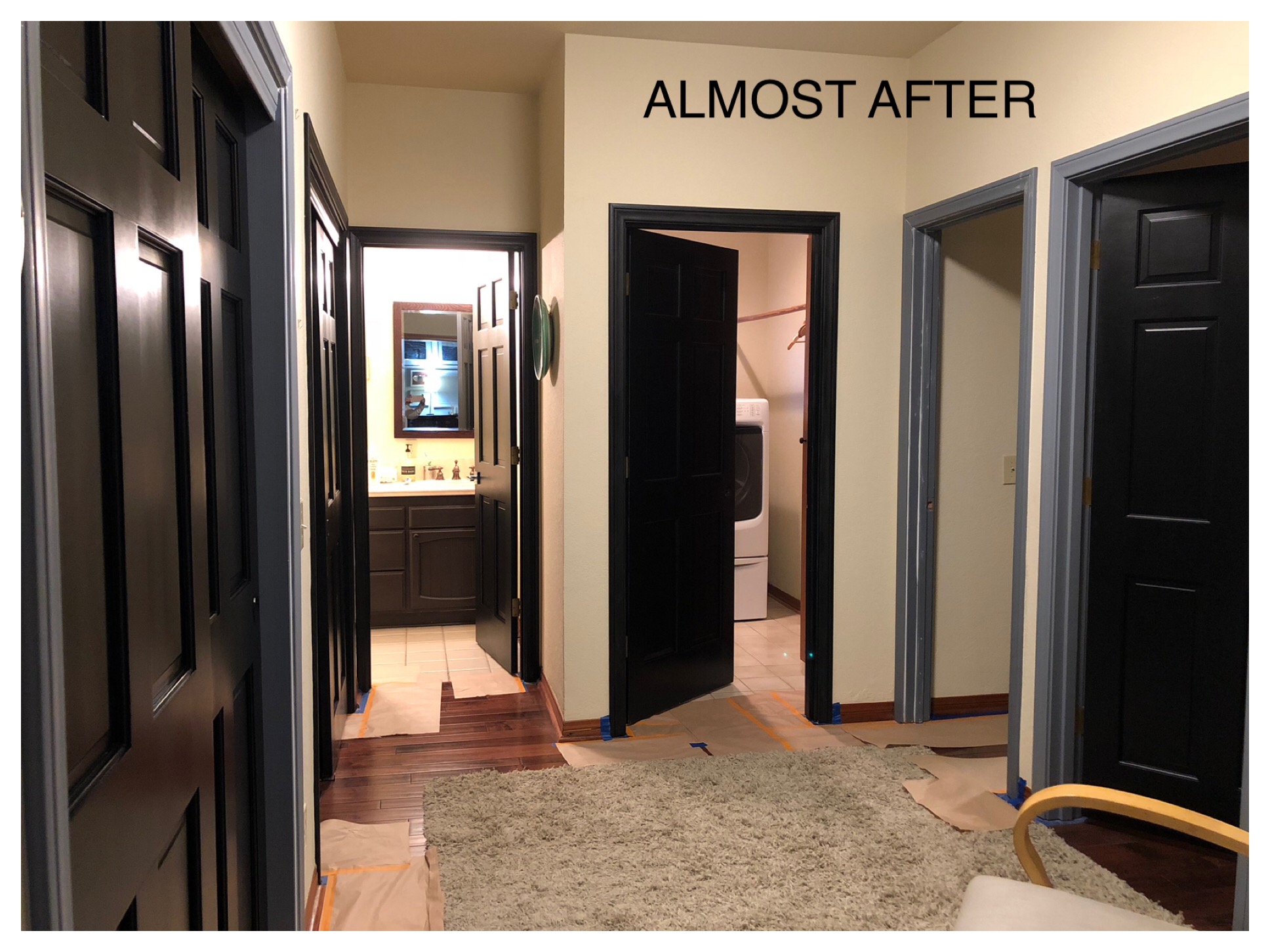
We are all familiar with the dated orangish stain color used in the late 1980’s and early 1990’s. It was used in bathrooms, kitchens but most prominently on interior doors. More often than not this stain was used on solid oak which is a high quality solid wood. There is no reason to replace a perfectly good door. Instead, consider paint. With the rich dark stained floors of this house, choosing black was the perfect option. Again, try out many options of the color you are choosing. Black, for instance, has underlying hues of red, purple and green. Dunn Edward’s Aristosheen Black was the best for our project.