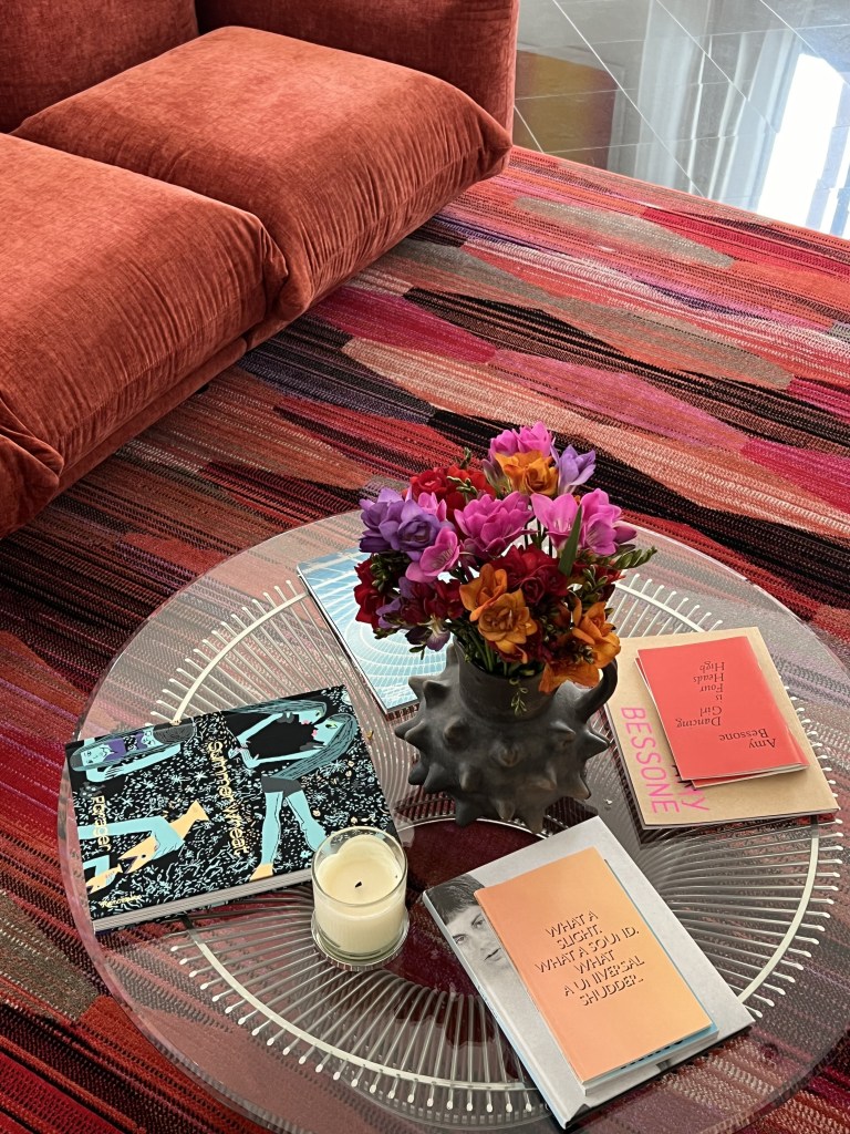
I read an article in Architectural Digest a few years ago about “dopamine décor” and wrote about it in an Instagram post. Since then, bold color has continued to emerge in interior design. The creamy, neutral palettes of years past are now being punctuated with vibrant hues. Daring shades of hot pink, emerald green, bright orange, vibrant blue, and even purple have surfaced on the pages of design magazines and in home décor stores worldwide. Colorful patterns, too, have made a comeback—radiant floral prints reminiscent of the 1980s are reappearing in mainstream design.
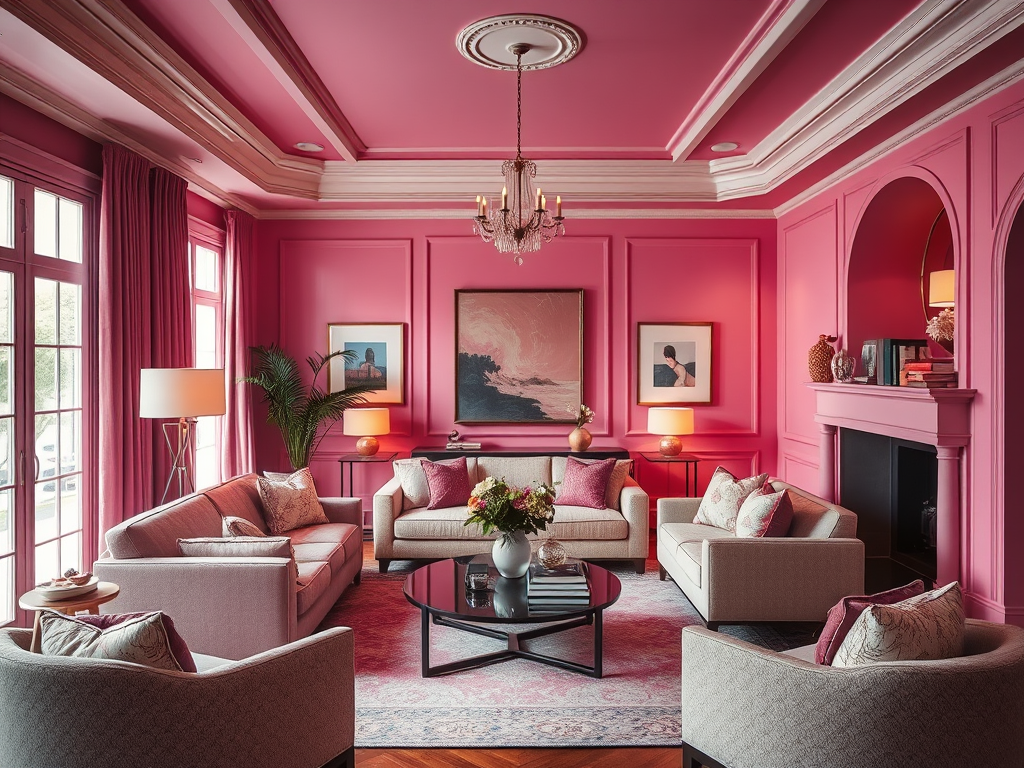
Color drenching (sometimes spelled colour drenching in design circles) is “in.” My grandmother painted her walls and trim a single bold color—turquoise. Today’s color enthusiasts are following suit, upholstering furniture and layering accessories in the same striking shade as their walls. Color drenching creates intimacy in a space. Using different paint finishes adds depth to a monochromatic room, while incorporating a single-color fabric in diverse textures enhances the effect.
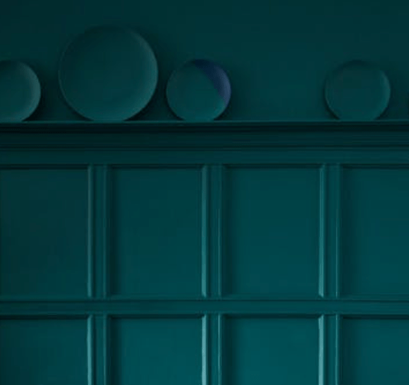
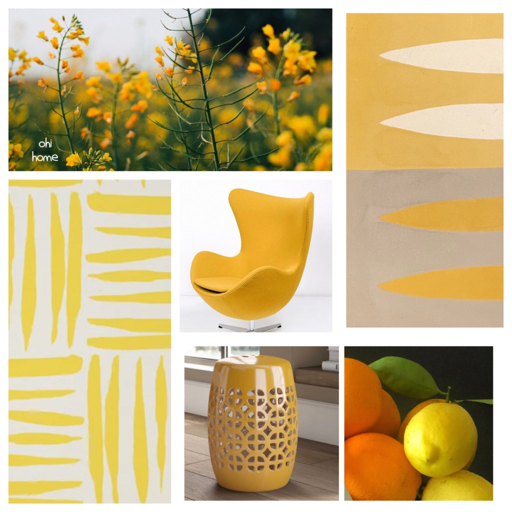
Lately, there seems to be an increasing desire for bright colors in our everyday lives—perhaps a response to the gray clouds of a politically divided country. We crave a bright hue in our day. Color lifts our spirits. My husband’s grandmother once described a yellow room we occupied as “feeling frisky.” Interiors evoke emotion; a bright yellow space fosters playfulness and excitement, while moody, dark tones on bedroom walls can help us settle into a deep sleep.
This color revolution marks a shift from traditional decorating, where ceilings, doors, and trim are often painted white, and accessories add only subtle touches of sophistication and comfort. Instead, color drenching embraces vibrant hues on every surface, weaving together all elements of a room into a cohesive and powerful design. Dopamine décor, in turn, introduces unexpected, high-impact pops of color throughout interiors.
This fresh perspective on living with color is slowly reshaping our homes—and our lives. Connecting our emotional state to the visual palette of the spaces we inhabit may be exactly what we all truly need.
